
![]()
As evidenced in some of my old posts (like this one and this one), I’ve become somewhat of a fan of superhero movies and television shows (though, as I have said before, not of the original comic books themselves). The fall 2014 television season featured a number of comic-based programs. Interested in comparing the popularity and success of the shows that fit into this genre, I gathered some data from IMDb (accurate as of 01/12/2015) and created some charts (included below). I focused on the five shows discussed in this article: Agents of S.H.I.E.L.D., Arrow, Constantine, The Flash, and Gotham. Personally, I am very much a fan of both Arrow and The Flash (both CW products) and am (at least for the time being) a semi-fan of Gotham (Fox). I have never watched S.H.I.E.L.D. (ABC) or Constantine (NBC). As an interesting side note, ABC just recently started airing episodes of its newest Marvel program, Agent Carter. There are some other shows that have (arguably less obvious) origins in the comics, but I decided to look at the five major ones listed above.
The overall IMDb ratings for the five shows look like this (as of 01/13/2015):
Agents of S.H.I.E.L.D.: 7.5/10
Arrow: 8.2/10
Constantine: 7.6/10
The Flash: 8.3/10
Gotham: 8.1/10
However, I did not create charts with overall ratings in mind. Instead, I was interested in performing an analysis which included data pertaining to each episode of each show. I think that this sort of analysis is probably better suited to evaluate a show’s success, as in my mind a good show possesses consistency. In other words, each episode is worth watching. I would prefer a show that has consistent 8/10 episodes than one that has a handful of 6s and a handful of 10s. This is why I enjoyed the second season of Arrow so much. It seemed as though each episode significantly contributed to the overarching plot of the showdown between Oliver and Slade or to a subplot that was just as riveting. Just take a look at the episode ratings for that season. The average rating is an 8.9/10 and all episodes are within 0.4 of the average.
Arrow Season Two IMDb Episode Ratings
| Episode | Rating |
| 1 | 8.9 |
| 2 | 8.7 |
| 3 | 8.9 |
| 4 | 8.9 |
| 5 | 8.9 |
| 6 | 8.6 |
| 7 | 8.6 |
| 8 | 9.1 |
| 9 | 9.1 |
| 10 | 8.5 |
| 11 | 8.8 |
| 12 | 8.9 |
| 13 | 8.8 |
| 14 | 8.9 |
| 15 | 9.1 |
| 16 | 8.7 |
| 17 | 8.5 |
| 18 | 9.1 |
| 19 | 9.1 |
| 20 | 9.1 |
| 21 | 9.1 |
| 22 | 9.1 |
| 23 | 9.1 |
The first season, while still worth watching, posts an average episode rating of 8.5 and all episodes fall within 0.6 of the average.
Anyway, here are the charts that I created. They are enlarged when clicked upon.
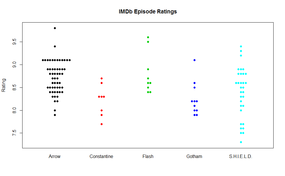
This plot displays the ratings of all episodes in each series. I used the beeswarm package in R to allow for ‘jittering’ as well as to experiment with alternate displays.
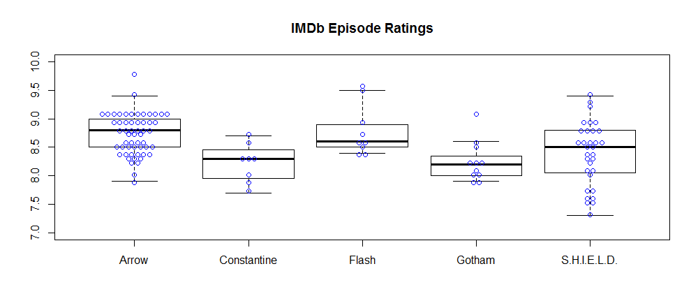
A box plot including individual points.
R code used to produce the two charts above:
#beeswarm package required--install.packages('beeswarm')
library(beeswarm)

#bee swarm plot overlaying box plot
boxplot(Rating ~ Show, data = tvraw,
        outline = FALSE,
        main = 'IMDb Episode Ratings',  xlab="",
        ylim=c(7, 10))
beeswarm(Rating ~ Show, data = tvraw, col = 4, add=TRUE, method="center") #plot on top of boxplot

#standalone bee swarm plot
beeswarm(Rating ~ Show, data = tvraw, pch = 16, col=1:5,
         main = 'IMDb Episode Ratings', xlab="")
I also created an interactive scatterplot that can be viewed by clicking the link.
Here is the IMDb dataset used in this analysis: Super IMDb.csv
Update (01/14/2015): In comparing seasons 1 and 2 of Arrow, it may be more instructive to compare the coefficient of variation (CV) in each sample. The CV for season 1 is 3.7% while the CV for season 2 is just 2.3%.

