Category Archives: Statistics

What is the best superhero TV show?

4241687-8569729115-arrow-

As evidenced in some of my old posts (like this one and this one), I’ve become somewhat of a fan of superhero movies and television shows (though, as I have said before, not of the original comic books themselves). The fall 2014 television season featured a number of comic-based programs. Interested in comparing the popularity and success of the shows that fit into this genre, I gathered some data from IMDb (accurate as of 01/12/2015) and created some charts (included below).  I focused on the five shows discussed in this article: Agents of S.H.I.E.L.D., Arrow, Constantine, The Flash, and Gotham. Personally, I am very much a fan of both Arrow and The Flash (both CW products) and am (at least for the time being) a semi-fan of Gotham (Fox). I have never watched S.H.I.E.L.D. (ABC) or Constantine (NBC). As an interesting side note, ABC just recently started airing episodes of its newest Marvel program, Agent Carter. There are some other shows that have (arguably less obvious) origins in the comics, but I decided to look at the five major ones listed above.

The overall IMDb ratings for the five shows look like this (as of 01/13/2015):

Agents of S.H.I.E.L.D.: 7.5/10

Arrow: 8.2/10

Constantine: 7.6/10

The Flash: 8.3/10

Gotham: 8.1/10

However, I did not create charts with overall ratings in mind. Instead, I was interested in performing an analysis which included data pertaining to each episode of each show. I think that this sort of analysis is probably better suited to evaluate a show’s success, as in my mind a good show possesses consistency. In other words, each episode is worth watching. I would prefer a show that has consistent 8/10 episodes than one that has a handful of 6s and a handful of 10s. This is why I enjoyed the second season of Arrow so much. It seemed as though each episode significantly contributed to the overarching plot of the showdown between Oliver and Slade or to a subplot that was just as riveting. Just take a look at the episode ratings for that season. The average rating  is an 8.9/10 and all episodes are within 0.4 of the average.

Arrow Season Two IMDb Episode Ratings

Episode Rating
1 8.9
2 8.7
3 8.9
4 8.9
5 8.9
6 8.6
7 8.6
8 9.1
9 9.1
10 8.5
11 8.8
12 8.9
13 8.8
14 8.9
15 9.1
16 8.7
17 8.5
18 9.1
19 9.1
20 9.1
21 9.1
22 9.1
23 9.1

The first season, while still worth watching, posts an average episode rating of 8.5 and all episodes fall within 0.6 of the average.

Anyway, here are the charts that I created. They are enlarged when clicked upon.

imdb beeswarm

This plot displays the ratings of all episodes in each series. I used the beeswarm package in R to allow for ‘jittering’ as well as to experiment with alternate displays.


imdb boxplot

A box plot including individual points.

R code used to produce the two charts above:

#beeswarm package required--install.packages('beeswarm')
library(beeswarm)

#bee swarm plot overlaying box plot
boxplot(Rating ~ Show, data = tvraw,
        outline = FALSE,
        main = 'IMDb Episode Ratings',  xlab="",
        ylim=c(7, 10))
beeswarm(Rating ~ Show, data = tvraw, col = 4, add=TRUE, method="center") #plot on top of boxplot

#standalone bee swarm plot
beeswarm(Rating ~ Show, data = tvraw, pch = 16, col=1:5,
         main = 'IMDb Episode Ratings', xlab="")

I also created an interactive scatterplot that can be viewed by clicking the link.

Here is the IMDb dataset used in this analysis: Super IMDb.csv

Update (01/14/2015): In comparing seasons 1 and 2 of Arrow, it may be more instructive to compare the coefficient of variation (CV) in each sample. The CV for season 1 is 3.7% while the CV for season 2 is just 2.3%. 

Assessing Team Popularity Using Google Trends Data

I recently completed a small project in which I analyzed the popularity of teams that compete in the four major sports. In the analysis, I looked at metropolitan areas that have at least one team in each of the four major sports. Using Google Trends, I gathered weekly data from 01/02/05 – 11/01/14 to assess the relative popularity of teams in cities that met the inclusion criteria. Each data point represents how frequently a team was queried on Google relative to the Miami Heat in the week of 06/16/13 – 06/22/13. This data point was set to 100. More importantly, higher numbers indicate a higher search frequency and, for all intents and purposes, greater popularity. Below, I’ve included a heat map that illustrates the contrasts in average popularity among city-sport combinations over the time period. Note that for cities home to more than one team in a given sport, I took the maximum team score each week. For instance, if the Yankees had a popularity score of 10 in one week and the Mets had a score of 5 in the same week, I would set the Yankees’ score to be the New York baseball score for that week.

popularity

R code I used to produce the heatmap (will require the gplots and RColorBrewer libraries):

row.names(all.data) <- all.data$City
all.data <- all.data[,-1]
scaleyellowred <- colorRampPalette(c("lightyellow", "red"), space = "rgb")(100)
heatmap.2(as.matrix(all.data), Rowv = NA, Colv = NA, col = scaleyellowred, density.info="none",
          trace="none", cexRow=0.8, cexCol=1, margins=c(6,6))

In my statistical analysis, I used three-way between-subjects ANOVA (with a season variable as a block) to assess whether certain cities and sports attract significantly greater levels of interest. I performed this analysis using data only from the year 2013. Furthermore, to account for violations of the normality assumption, I performed a log transformation on the data. This did not affect the interpretability of results because, as alluded to above, the numeric quantities themselves added little value to the analysis. Additionally, the ordinal relationships remained intact after the log transformation. Here are slides with results from the project and the raw data from Google Trends.

Monte Carlo Estimation of Pi

Yesterday, I came across a neat way to approximate π using Monte Carlo simulation. I hadn’t seen this exercise before, but I think it is understandable and illustrative, so I decided to give it a try using both Excel and Python.

How it Works

Imagine we have a unit circle inscribed within a 2×2 square.

plotcircle2

Now, let’s zoom into the top-right quadrant of this plot.

plotcircle

The area of this entire quadrant is equal to r2 (since the base of the square equals the circle’s radius). The area in blue is a quarter-circle and is equal to (1/4)πr2. Thus, if one were to plot points within this quadrant at random, we would expect that π/4 (approximately 78.54%) would lie within the blue region. Theoretically, then, to estimate π, one can generate a bunch of coordinate pairs with x and y values between 0 and 1. If the distance of a particular point from the origin is greater than 1 (greater than the radius of the circle), it is classified as outside of the circle. Otherwise, it is contained within the circle. With a large enough sample, the proportion of points within the circle should be close to π/4. We can then multiply this proportion by 4 to estimate π.

To get the distance of a point from the origin, we use the Pythagorean theorem:

Distance=sqrt(x2 + y2).

Executing this using Excel

To carry out this process in Excel, I created two separate sets of 11,175 random numbers between 0 and 1 using the =RAND() function. I then calculated the distance for each pair. Next, I used an =IF() function to generate indicator variables corresponding to whether or not the calculated distance was greater than 1. Finally, I used =COUNTIF() to count those distances less than or equal to 1, divided this count by the total number of distances calculated (11,175), and multiplied this fraction by 4 to get an estimate of π.

Once all of this is in place, it is quick and easy to get estimates by pressing F9 to refresh the random numbers.

Here are 10 of the estimates I generated (accurate to 5 digits):

3.14917, 3.12447, 3.14309, 3.13879, 3.14452, 3.14130, 3.12197, 3.12841, 3.13128, 3.15347

For reference, the true value of π to 5 digits is 3.14159.

Here is a spreadsheet setup to carry out this simulation exercise.

Executing this using Python

I also replicated this process using Python. When replicating this process programatically, it is much easier to increase the scale (i.e., number of distance estimates).

Here is my Python code:

#single point estimate
import random
from math import *
from __future__ import division

n=100000 #number of random number pairs

my_randoms = [] #create empty list to store distance calculations

for _ in range(0,n):
    my_randoms.append(sqrt((random.random()**2) + (random.random()**2))) #distance calculation
    
pi_estimate=(sum(x<=1 for x in my_randoms)/n)*4

print pi_estimate

Using 100,000 random number pairs, here are 10 estimates that I got:
3.12924, 3.16036, 3.14132, 3.14204, 3.13932, 3.13904, 3.1464, 3.14028, 3.14208, 3.13856

Simulating this process programatically also allowed me to go one step further. Again, I used the random number pairs to generate an estimate of π (this time “only” 10,000 pairs to spare my computer from the extra calculations). However, using a nested for-loop, I repeated this process 10,000 times! One can then take the average of the 10,000 π estimates to get an even better approximation of π. Additionally, one can test the validity of the Central Limit Theorem to see if the 10,000 estimates are normally distributed.

Here’s my Python code to do just this:

#average of 10,000 estimates; takes some time to run
import random
from math import *
from __future__ import division
import matplotlib.pyplot as plt

n1= 10000 #number of pi estimates 
n2= 10000 #number of random number pairs to use in pi estimate

pi_list=[] #create empty list to store pi estimates

for _ in range(0,n1): #n1 iterations
 my_randoms=[] #create empty list to store distance calculations
 for _ in range(0,n2):
 my_randoms.append(sqrt((random.random()**2) + (random.random()**2))) #distance calculation
 pi_list.append((sum(x<=1 for x in my_randoms)/n2)*4)

print sum(pi_list) / float(len(pi_list)) #average pi estimate

plt.hist(pi_list) #histogram of pi estimates

Using this program, my distribution of π estimates looked like this:

histogram

Without any hesitation, I would say that the estimates follow a normal distribution.

After only one execution of this program, I received a π approximation (based on the average of 10,000 estimates) of 3.14168, which is just .00009 off from the true value of π.

Super(hero) Statistics, Pt. II

Building off my previous post, in which I introduced a neat superhero dataset and presented graphical descriptions of the data, in this post I would like to address differences in traits between superheroes and supervillains.

1. Descriptive Statistics

Below, I’ve included mean ratings for both superheroes and supervillains.

Variable Mean for Supervillains (n=123) Mean for Superheroes (n=304)
Intelligence 67.46 60.22
Strength 46.11 38.17
Speed 37.03 38.26
Durability 62.00 56.28
Power 59.67 55.48
Combat 59.87 60.50
Total 332.15 308.91
Source: http://www.superherodb.com

Surprisingly, we can see that, on average, the villains possess higher total ratings (sum of the six ratings) than do the heroes. However, we (or at least I) typically think of superheroes as being superior to their rivals. On the other hand, creating villains to be more extraordinary creatures than their counterparts makes the heroes’ ultimate triumphs even more impressive. This makes for good underdog stories.

Now, let’s add variance into the equation and look at boxplots of the data.

boxplots

Note: “bad” refers to villains and “good” refers to heroes

Without any formal discussion, I’ll make a quick remark about the spread of the ratings. There is more spread (as measured by standard deviation) in ratings for villains in 5 of the 6 categories (all but combat). Practically, this leads me to believe that villains are more diverse in makeup than heroes. For an anecdotal example, Joker is a very different villain than Blob.

Name Intelligence Strength Speed Durability Power Combat
Joker 100 10 12 56 22 90
Blob 10 83 23 95 26 72
Difference 90 -73 -11 -39 -4 18

2. Incorporating Uncertainty

From the analysis so far, one can easily see that there are differences in the average scores between villains and heroes. Now, I was tempted to take these differences as “real” but, upon further consideration, second-guessed myself.

I faced a statistical conundrum which statisticians working with real world data rarely, if ever, face. The reason I was tempted to say, for instance, that villains are about 4 points more powerful than heroes is because I thought my sample was essentially the population. Upon further examination, however, I recalled that I had cut 171 subjects from my sample because of missing values and that there are probably superheroes and supervillains out there not included in the superhero database. So, since my sample is just that, a sample, I decided to incorporate some uncertainty into my estimates. (Now, if this were a real world problem, I would need to be sure that my missing data were missing at random to assure that I was working with a random sample. In this case, I will make that assumption and proceed, though it is probably not valid. I think that the results will still be interesting and worthy of discussion).

Below are estimated ranges for the true differences between supervillains and superheroes for each of the six ratings categories.

Variable 95% CI of Mean (Villain-Hero)
Intelligence (2.5336, 11.9591)
Strength (1.2240, 14.6616)
Speed (-6.0548, 3.5935)
Durability (-0.5996, 12.0338)
Power (-1.5122, 9.8915)
Combat (-5.4797, 4.2130)

After incorporating uncertainty, we only detect significant disparities in two (intelligence and strength) of the six categories. If I were to account for multiple comparisons, then only intelligence would differ significantly between the two groups.

3. P (Hero | Characteristics)

Now that we have been exposed to at least some evidence to suggest that there are detectable differences in traits between superheroes and supervillains, I am interested in answering the following question:

Given that a character possesses a particular set of ratings, can we predict if that character will be a hero or a villain? 

“Practically”, this would allow one to predict the alignment of a new member to the world of superheroes and supervillains.

To address this question, I created a logistic regression model. Overall, I would say that the model does not do a great job of predicting alignment (perhaps due to the considerable amount of variability among both heroes and villains), but there is still some useful information which I will share.  I’ll present these results in terms of odds ratios.

Effect Point Estimate 95% Wald Confidence Limits
Intelligence 0.982 (0.971, 0.993)
Strength 0.992 (0.982, 1.001)
Speed 1.012 (1, 1.023)
Durability 0.998 (0.987, 1.008)
Power 0.998 (0.989, 1.008)
Combat 1.008 (0.998, 1.019)

When controlling for other ratings, intelligence and speed play a significant role in predicting alignment. Here are their interpretations:

  • Holding other factors fixed, a one unit increase in intelligence rating decreases the odds that a character is a superhero by 1.8%.
  • Holding other factors fixed, a one unit increase in speed rating increases the odds that a character is a superhero by 1.2%.

4. Conclusions

In my mind, the biggest takeaway from this analysis is the role that intelligence plays in distinguishing superheroes from supervillains. The villains possess significantly higher levels of intelligence than their enemies, the heroes. I guess it makes for a good story when the good guy outwits the evil mastermind.

******************************************************************************

As in Pt. I, I was working with this dataset.

Below is code used, which, for this particular post, I feel is rather straightforward.

R code for the boxplots:

#create a panel of boxplots; separate by alignment
hero_vill <- read.csv("~/Blog/hero_vill.csv", stringsAsFactors=TRUE)
par(mfrow=c(3,2))
boxplot(hero_vill$Intelligence~hero_vill$Alignment, col=rainbow(2), main="Intelligence Ratings")
boxplot(hero_vill$Strength~hero_vill$Alignment, col=rainbow(2), main="Strength Ratings")
boxplot(hero_vill$Speed~hero_vill$Alignment, col=rainbow(2), main="Speed Ratings")
boxplot(hero_vill$Durability~hero_vill$Alignment, col=rainbow(2), main="Durability Ratings")
boxplot(hero_vill$Power~hero_vill$Alignment, col=rainbow(2), main="Power Ratings")
boxplot(hero_vill$Combat~hero_vill$Alignment, col=rainbow(2), main="Combat Ratings")

SAS code for t-tests & logistic regression:


*data processing;
data hero_vill;
infile "~/Blog/hero_vill_1.csv" dlm=',' dsd missover;
input Name :$32. Alignment $ Intelligence Strength Speed Durability Power Combat Total;
if Alignment='good' then Hero=1;
else if Alignment='bad' then Hero=0;
else delete;
run;
*t-tests;
proc ttest data=hero_vill plots=none;
class alignment;
var intelligence;
run;
proc ttest data=hero_vill plots=none;
class alignment;
var strength;
run;
proc ttest data=hero_vill plots=none;
class alignment;
var speed;
run;
proc ttest data=hero_vill plots=none;
class alignment;
var durability;
run;
proc ttest data=hero_vill plots=none;
class alignment;
var power;
run;
proc ttest data=hero_vill plots=none;
class alignment;
var combat;
run;
*logistic regression;
proc logistic data=hero_vill;
model Hero(event='1')=Intelligence Strength Speed Durability Power Combat;
run;

Super(hero) Statistics, Pt. I

Superheroes

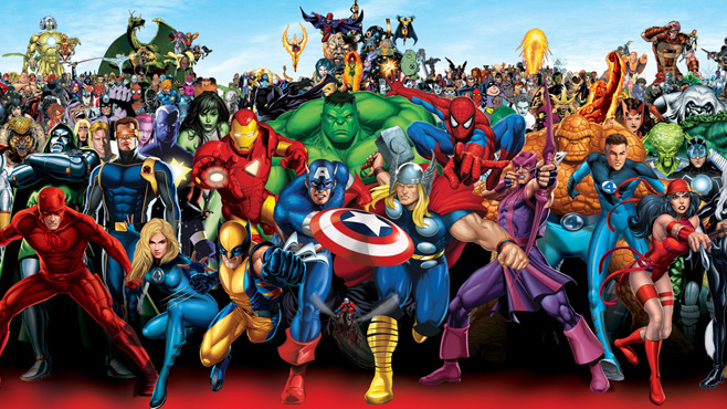
Today, I will post the first of several entries relating to a unique dataset that I’ve put together–a dataset that contains over 600 rows of data on a topic of great importance……………..superheroes and supervillains! Okay, analyzing superhero data may not be the most urgent matter that we as a society face, but:

1) I think that it is often useful to include entertaining applications when demonstrating what may otherwise be dry statistical methodology (though, admittedly, I sometimes find the “dry” statistics entertaining as well).

2) I find it fun to casually talk to friends about superheroes (especially those in recent movies) simply because, well, it’s just that: fun! And much like sabermetricians use statistics to challenge what is thought to be conventional baseball wisdom, I hope to use statistics to address pertinent topics relating to superheroes and supervillains (let’s call this discipline supermetrics?).

Setting the Stage

Before I get into the statistical analysis of the data, I must put a few things on the table.

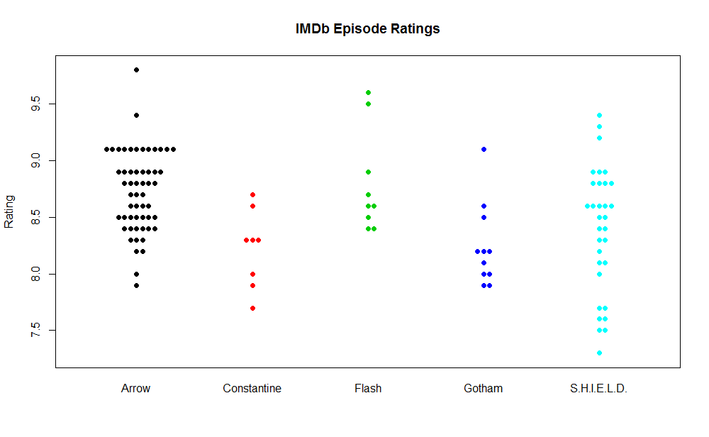
1) Disclaimer I do not claim to be a superhero enthusiast, expert, or anything of the kind. I don’t think I have ever read a comic book in my life. I am, however, a fan of superhero movies (e.g., Man of Steel, The Dark Knight, Captain America, The Avengers, etc.) along with the television show, Arrow. So what does this tidbit have to do with anything? For one, with regard to my statistical analyses, it’s probably a good thing that I’m not a huge supporter of any given hero or villain. This should play a role in producing unbiased results. Additionally, my unfamiliarity with the comic book universe becomes a disadvantage in terms of data familiarity. Namely, I am fairly confident that I would not be able to recognize any superhero that is over- or underrated (more on the data below), making erroneous calculations more likely. With this in mind, if any comic book experts out there see any peculiar results, they are certainly welcome to leave a comment or drop me an email.

2) Data The data in the dataset that I will use to conduct my analyses come courtesy of the Superhero Database. This site houses a collection of information about 611 superheroes and villains. Each character (with data) is given a score between 0 and 100 (except in a few rare cases, where characters are deemed to be worthy of scores greater than 100) for six different traits: Intelligence, Strength, Speed, Durability, Power, and Combat. For example, here are the ratings for Batman:

Intelligence Strength Speed Durability Power Combat
100 18 27 42 37 100

Correction. Each character actually has two sets of these ratings. One such set is attributable to the creation of the website (the website was created to log and rate superheroes) while the other set is an average of user ratings. I chose to use the site’s ratings (the first set) because it allowed for a more complete dataset (many heroes and villains were not rated by users). In the event that the users rated the character and the site itself did not, I simply used the users’ ratings. After using this strategy, I came out with 440 superheroes/villains on which to perform analyses (171 subjects without usable ratings from either the site or its users).

I have one final note on the data. It is obviously highly subjective. When a human being is rating anything, there is always an element of subjectivity. Superheroes pose a particular challenge because they are fictional (so we are assigning subjective ratings to characters that were developed based on an author’s subjectivity). So please do not take the analyses too seriously, but certainly have fun critiquing and debating them! (Note: I do like how ratings can take on any discrete value between 0 and 100. This large range allows raters to address subtle differences among superheroes/villains.)

Visualizing Differences in Superhero Traits

The first items that I will present in analyzing this dataset are heatmaps.

Heroes

I created a non-random sample of superheroes to include big names. I did this using my opinions of which superheroes are popular and by surfing the web for lists of popular superheroes. After I had a list of about 20 heroes, I generated a heat matrix using R that color-coded the six attributes for each hero.

heroes

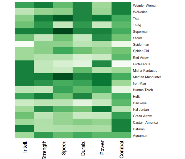
Superheroes and their ratings. A darker shade corresponds to a higher rating relative to peers.

I really like this form of visualization. One is able to view 126 individual data points in this graphic and I can assure you that it is easier to gain a grasp of the data using colors in the matrix rather than numeric values. Does anything stand out to you? Martian Manhunter, Superman, and Thor all have relatively high ratings across the board. And as we saw above, while Batman is exceptionally intelligent and excels in combat, he could use work in the other four departments.
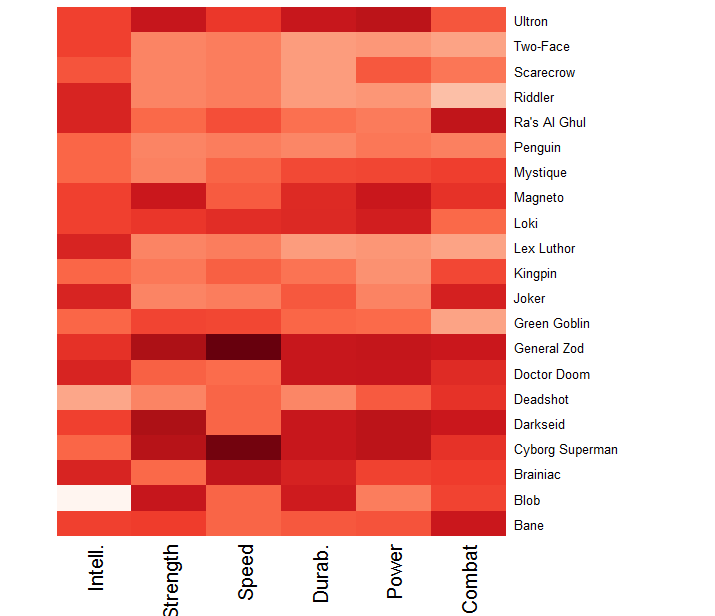
Villains

I replicated the heatmap visualization using popular supervillains in place of superheroes. (Note: This graphic is probably a bit biased toward Batman villains, because those are the most familiar to me and I felt compelled to include them!)

villains

Supervillains and their ratings. A darker shade corresponds to a higher rating relative to peers.

Here we can see that General Zod–who you may have recently seen in Man of Steel— is, for lack of a better term, a beast. He possesses an attribute score of at least 94 in each of the six categories. Interestingly, it becomes apparent that many of the famous Batman villains (e.g., Joker, Penguin, Riddler, and Two-Face) rely on a high level of intellect to challenge Batman. Then, however, we have Ra’s Al Ghul and Bane; both villains possess extraordinary combat ratings.

Closing Remarks

This post was devoted to introducing the superhero/villain dataset with which I will be working in subsequent posts. Additionally, I took a first step in statistically analyzing the data by visualizing differences in characteristics among heroes and villains. I’d be interested to hear whether anything jumps out to you when studying those graphics!

In future posts, I aim to move beyond visualizing the data by applying various statistical methods to the data. Hopefully you find the superhero data and the relevant questions that can be addressed both fun and entertaining, but also of practical importance with regard to the statistical methods being employed.

******************************************************************************

Download the data (.xls): Superhero & Supervillain Data

R code:

#source used: http://flowingdata.com/2010/01/21/how-to-make-a-heatmap-a-quick-and-easy-solution/
#will need to install ggplot2 and RColorBrewer

#generate heatmap for select, non-random, heroes
super <- read.csv("~/Blog/select.csv", stringsAsFactors=FALSE) #read-in CSV file; insert appropriate path
super <- super[order(super$Name),] #sort heroes alphabetically
row.names(super) <- super$Name
super <- super[,3:8] #using these 6 columns for analysis
super_matrix <- data.matrix(super)
super_heatmap <- heatmap(super_matrix, Rowv=NA, Colv=NA,
			col = colorRampPalette(brewer.pal(9,"Greens"))(1000), scale="column",
			margins=c(5,10))

#generate heatmap for select, non-random, villains
vill <- read.csv("~/Blog/selectvill.csv", stringsAsFactors=FALSE) #read-in CSV file; insert appropriate path
vill <- vill[order(vill$Name),] #sort villains alphabetically
row.names(vill) <- vill$Name
vill <- vill[,3:8] #using these 6 columns for analysis
vill_matrix <- data.matrix(vill)
vill_heatmap <- heatmap(vill_matrix, Rowv=NA, Colv=NA,
                         col = colorRampPalette(brewer.pal(9,"Reds"))(1000), scale="column",
                         margins=c(5,10))


The Logic of Sherlock Holmes

The Reminiscenses of Jon

Over the past few years, I’ve become a Sherlockian so to speak, though not in the traditional sense. I’ve watched the Robert Downey, Jr. films and both Series 1 and 2 of BBC’s Sherlock (hopefully Series 3 will be up on Netflix relatively soon!). I have also become an avid viewer of CBS’s Elementary adaptation. Until very recently, however, my interest in Holmes’ and Watson’s adventures had nothing to do with Sir Arthur Conan Doyle’s novels and short stories. That I neglected to read about the original Holmes is likely a mistake on my part, but one that I am attempting to quickly correct.

tumblr_mcyew5hyHm1r6mt8go1_500

Three modern day Sherlocks. From left to right: Jonny Lee Miller, Robert Downey, Jr., and Benedict Cumberbatch.

Seeing that my spring semester just concluded, I’ve found myself with a good deal of free time—free time perfectly suited for some pleasure reading. Now, when I do have time to read for pleasure—which certainly does not occur frequently during school semesters—I almost always choose to read nonfiction (in my mind, I’d rather learn something about a topic of interest to me than read something that is made up (this is a topic for another day)). This time, however, I decided to give Sir Arthur Conan Doyle a chance and, so far, am very happy I did.

I’ve read A Study in Scarlet, The Sign of Four, and a couple of short stories so far. I think another reason why I hesitated to dive into the old readings is, well, because they are old. For reference, A Study in Scarlet was published in 1887 and The Sign of Four in 1890. I’ve never particularly enjoyed reading books published prior to the 20th century because of the antiquated language and style, but, again, Holmes has not disappointed, which prompted me to write this post.

Back to the stories themselves though.  What has impressed me about the literary Sherlock is the logic that he uses to make his deductions. On a screen, it is easy to convey how Holmes deduces something about a person. I thought it would be difficult to replicate this precise process through writing, but Sir Arthur Conan Doyle does exactly this in very succinct fashion. While there are more involved deductions in the novels, take this brief passage, from The Sign of Four, for example,

Observation tells me that you have a little reddish mold adhering to your instep. Just opposite the Wigmore Street Office they have taken up the pavement and thrown up some earth, which lies in such a way that it is difficult to avoid treading in it entering. The earth is of this particular reddish tint which is found, as far as I know, nowhere else in the neighborhood. So much is observation. The rest is deduction.

Now it is possible for one to argue that there are flaws in Holmes’ logic every so often, but I think that much of the logic is rather sound for the purpose of storytelling.

What I really wanted to get into with regard to the Holmes books, however, is some of the logic which literary Sherlock employs to crack cases and its robustness in real-world applications. Namely, in A Study in Scarlet, I read, “It is a capital mistake to theorize before you have all the evidence.  It biases the judgment.” While in The Sign of Four, I encountered the famous line, “when you have eliminated the impossible, whatever remains, however improbable, must be the truth.” Let me address both in turn.

“It is a capital mistake to theorize before you have all the evidence. It biases the judgment.”

I entirely agree that evidence should always come before theory, else we run into the issue of manipulating evidence to suit a theory. Though I question, do we need all evidence in order to craft a strong theory? I tend to think not. Bayesian inference techniques rely on using new information to update probabilities and, ultimately, theories. Take the sunrise for instance. I am pretty darned sure that the sun will rise tomorrow. But am I certain? The answer is no. Each day that I see it rise I get more evidence that it rises every day, but I will never be 100% sure. Imagine living eons ago and witnessing the sunrise for the first time. Would you think it would follow the same pattern day-in and day-out? If in that position I know I wouldn’t bet on that with 100% certainty. But each day I witnessed the sun rise, I would up the probability of it following the pattern.

Verdict: While it is ideal to have all of the data before making a decision or crafting a theory (whatever the discipline may be), this is rarely feasible. Sherlock Holmes himself never has access to all of the data related to a case. I think that it is best to craft a theory once an ample amount of evidence is obtained and to constantly update that theory when new evidence becomes available. Also, I believe that it is important to be transparent and to let your audience know of the limitations of your theory (limited data, missing data, etc.) so that they may judge the validity and merit of your theory on their own).

“when you have eliminated the impossible, whatever remains, however improbable, must be the truth.”

I think that this logic is intuitively appealing.  I think that, similar to the other quote which I discussed above, it fundamentally speaks to the dangers of biased judgment. I think one ought to delve into a problem with a hypothesis about what is true, but should be prepared for that hypothesis to fail. If too attached to a hypothesis, one runs the risk of manipulating the data/evidence to fit that hypothesis.

Verdict: I’d take Sherlock’s advice. If the data proves a hypothesis wrong in favor of a seemingly improbable result, admit that the data proved you wrong. Be open. Now, I certainly find it acceptable to dig deeper and try to reveal why your hypothesis was wrong. This leads to even more knowledge creation and understanding. Replication, meta-analyses, and peer-reviews are all valuable in this regard.

While Sherlock Holmes is fun and entertaining, I think that practical lessons can be drawn from his adventures. I always like to get something that I can apply in the real-world out of a book or movie, and from Sherlock Holmes, I take away lessons in logic.